Kathleen Fulton is Taza Chocolate's Brand Manager. Born and raised on Boston's South Shore, she has long been interested in art and design. In college, she studied studio arts and attended school for architecture and earned her MBA from Simmons College. A passionate cyclist, Kathleen met Alex after a bike tour in 2005. Kathleen developed the Taza brand, including designing the logo and packaging. Alex and Kathleen were married in the summer of 2008 and have two daughters, Cora and Sloane.
Where to start. Like most projects we work on together—Alex and I—there is no clear beginning or end. We have been making it up as we go along since 2005, in all things Taza, and life, and so far, so good.
We have learned a lot and evolved our products from inside out. Our Origin Bars are an excellent example. What started out as a 3 oz. bar is now a thinner 2.5 oz. bar which makes it easier to break off and eat. The original white and red band-wrapper bar that showed silver foil peaking out on either side has become a bright, bold envelope-wrapped bar that is more visible on the shelf. The chocolate industry has experienced exponential growth since we started Taza in 2005, and we have to innovate and change with it to stand out in the blossoming sea of chocolate makers.
Taza Origin Bars Design Journey
Iteration #1: Red on White Letterpressed
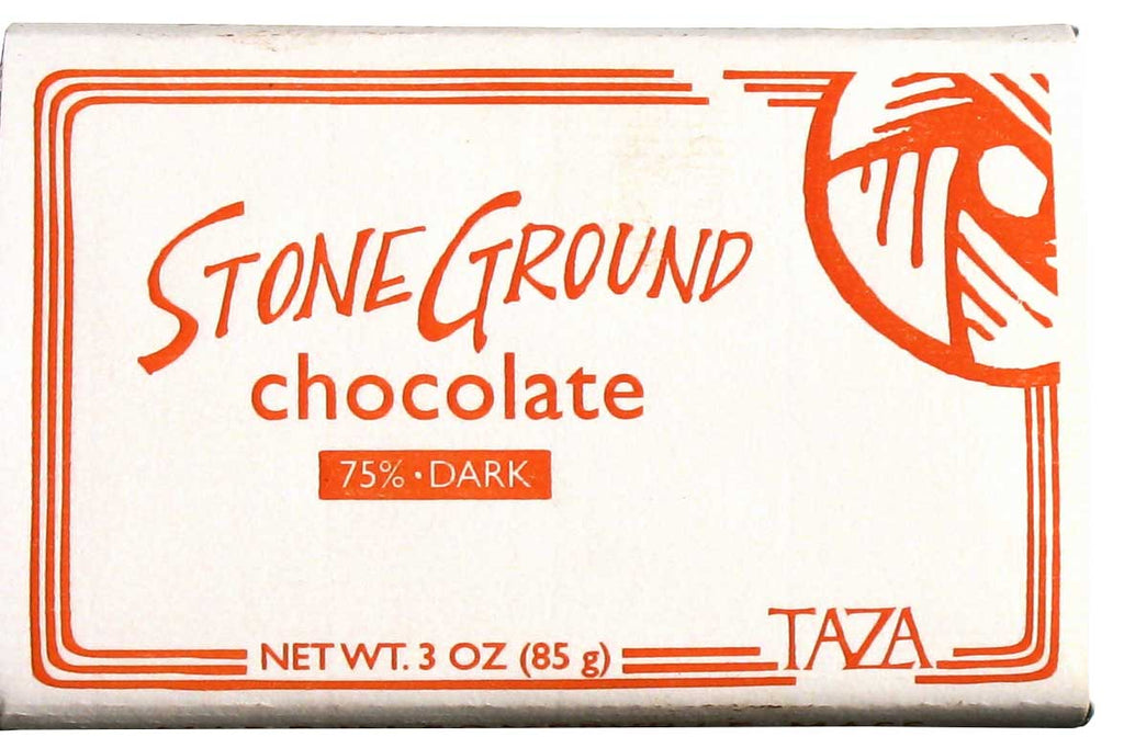
In the winter of 2007, I designed our first 3 oz wrapper. It was a 75% Stone Ground Chocolate Bar that we released for Valentine’s Day. It was letterpressed by Albertine Press using red ink on thick white paper. The front of the bar was framed by three lines that were inspired by the pattern and movement of our millstones. I imagined the lines extending out of the graphic of the millstone illustration that sits in the upper right corner and spinning around the frame of the bar, just as the millstones rotate in our molinos. On the sides of the bar we proudly declared “HANDMADE IN SOMERVILLE, MASS.” It is hard to believe now since Somerville is the hotbed of most things cool in the Boston area, but at the time Somerville held way less cache than Cambridge, locally or afar. This hastily designed wrapper was simple and imperfect but it gave us a starting place.
Iteration #2: Solid Colors
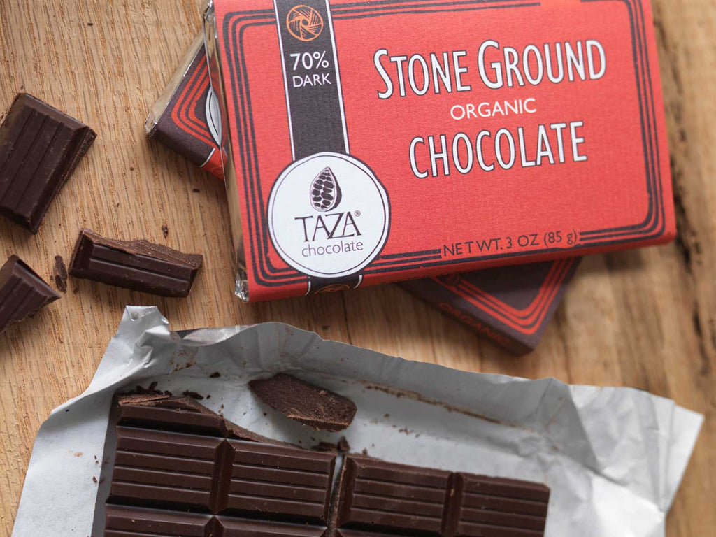
In the fall of 2007, the success of our 75% bar encouraged us to create a line which included 60%, 70% and 80% dark chocolate. We designed a new set of wrappers to launch the line. We decided to move away from letterpress due to cost and limitations, and instead found a great local printer, Ambit Creative, who worked with us to find a paper type that we could use to hand wrap our bars. I borrowed some elements from the Red and White design including the three lines drawn around the frame of the bar, and “HANDMADE IN SOMERVILLE, MASS” on the side of the bar, and created a design that was saturated in muted colors. Inspired by cigar boxes, I scaled down the millstone illustration and repeated it in a band that ran down the left side of the bar. This design was intended to evoke a venerable, timeless feeling.
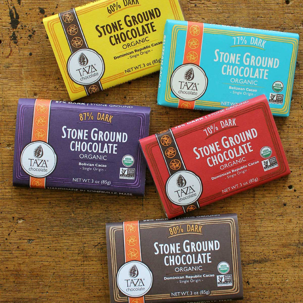
This design has not changed drastically in the past nine years. We’ve made some tweaks to the hierarchy—the order of emphasis placed on the information presented on the front of the bar—based on what people seemed to respond to. We’ve moved the percent dark from here to there. We’ve emphasized origin. We’ve de-emphasized origin. We’ve added flavor notes. We’ve taken out flavor notes. We’ve added bars and origins to the line. But the overall design has stayed recognizably related to the original solid color wrapper.
Iteration #3: Bright and Bold
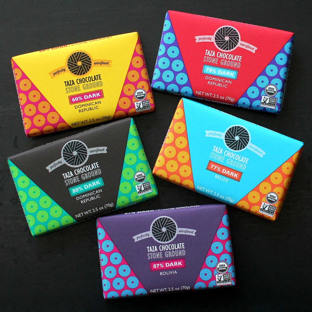
Now it is 2016, and we are releasing a new Origin Bar wrapper that is drastically different from iterations #1 and #2. During the design of The Taza Chocolate Bar at the Boston Public Market in 2015, I tackled a project that I had long looked forward to—I reworked our hand-drawn millstone image into a clearly defined graphic. In the summer of 2015, I used this millstone graphic in a design for the our new 84% Haiti Bar wrapper. Launching that new Origin Bar as a Whole Foods Market exclusive gave us the opportunity to rethink the Origin Line design and give it a much needed and deserved refresh. The colors are bright and inspired by our Central American, South American and Caribbean cacao sources. The new millstone graphic is a key design element used both in the patterned background and in the logo. The information hierarchy is stripped down and clear. This wrapper will shout loud and proud on the shelf, and boldly own the stone ground, perfectly unrefined chocolate that it is folded around more than any of the previous iterations.